
Gritty Graphs - Pies everywhere
In this week's edition of Gritty Graphs, we're tackling a longstanding issue that surfaced with the inception of the first MBA program: the excessive and improper use of pie charts.
It's important to acknowledge that pie charts are visually appealing. They resemble pizzas and can be beautifully enhanced with various aesthetic features in MS Excel. Despite their allure, from a practical standpoint, pie charts are intrinsically challenging for humans to interpret effectively.
We will delve deeper into this subject to understand the underlying issues better.
Pie charts are two-dimensional displays of one-dimensional data. Let's break this down. Consider a traditional graph: it has two dimensions, represented on the x and y axes, showing how one variable changes with another. This applies even to three-dimensional graphs. While we can't visually represent four dimensions, our brains can comprehend up to three dimensions quite well.
Now, think about pie charts. They depict only one variable – a budget allocation or a count of boys and girls. Yet, they are presented in two dimensions on paper or screen. This two-dimensional representation of a single variable can be challenging for our brains to interpret accurately, often leading to errors in understanding.
Some of you might wonder, what's an alternative to using pie charts?
Well, one option is to use a table. It's simpler and more straightforward to understand numbers, providing the same information more straightforwardly.
I'd recommend a bar chart if you're inclined to use a graph. Bar charts are two-dimensional, like pie charts, but they offer clearer separation between categories within the data.
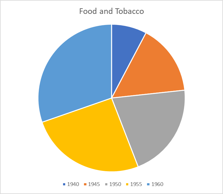
Let's put this into practice. Consider the USPersonalExpenditure dataset, readily available in the R programming environment. Here's how it can be effectively visualized.
This is the whole of the data:
This demonstrates the U.S. spending across different categories.
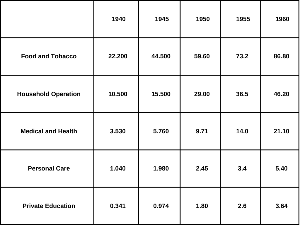
For this analysis, I chose MS Excel over R, using the 'insert pie chart' and this was the first graph it displayed:
While the pie chart appears tidy initially, it lacks effective storytelling capabilities. Excel portrays each year as a separate component within the food expense category, leading to a somewhat misleading representation.
A better approach would be to analyze how the spending composition changes yearly. By modifying the chart's variables, we can gain clearer insights.
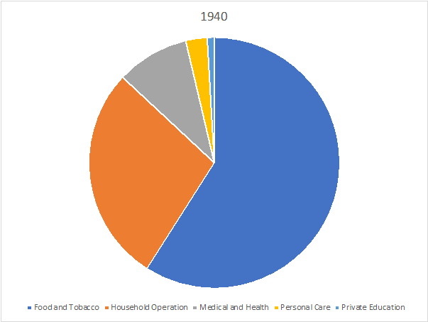
The updated chart provides a more meaningful story. For example, in 1940, the most significant expenses were Food and Tobacco, followed by household and medical costs.
But then, have a look at this:
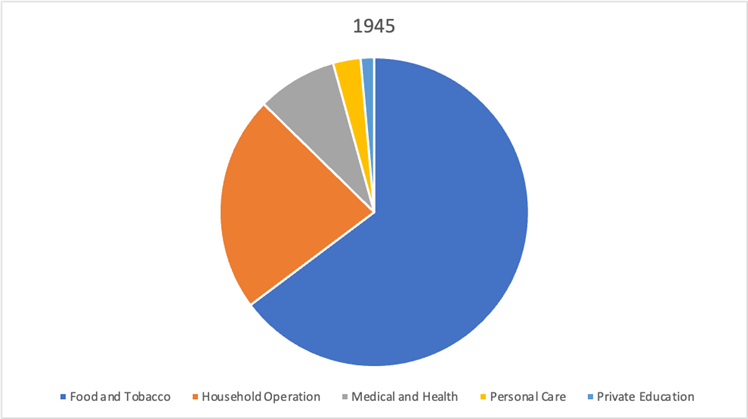
However, comparing 1945 and 1940 raises questions: Did World War II impact medical and healthcare spending? The pie chart shows a percentage drop, but it does not illustrate all the nuanced relationships.
Conversely, the table we started with offers a more straightforward comprehension, becoming increasingly beneficial as more years are added to the analysis. This underscores two crucial points: firstly, Excel's graphic insert feature can be misleading, and secondly, it's vital to consider the reader's perspective for clarity and comprehension.
Adding data labels to pie charts might solve these issues. But if the text is required to convey the message, then the utility of the graphic itself becomes debatable.
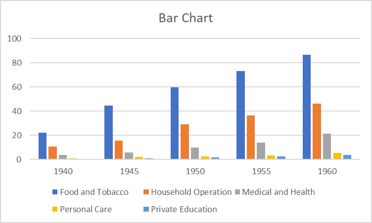
Is there a more efficient graphical method? Absolutely! Consider using lollipop charts, bar charts, or other types of area charts for a more effective visual representation of the data.
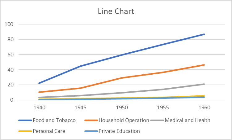
You can also go with line charts in this case:
What do you think of these alternatives? Have they refreshed your perspective, or do you feel the pie chart concept needs to be more consistent?
In summary, here are the crucial takeaways from our discussion:
- Automated chart features can sometimes lead to significant inaccuracies.
- Adopting the user's perspective is crucial for effective data presentation.
- Feel free to explore options to find what best narrates your data story.
This article has provided valuable insights into choosing the right graphical tools for your data.