
Gritty Graphs - Crafting Animated Data Narratives with R and gganimate
Remember Hans Rosling TED talk where he shows us how to use the GapMinder Data? Remember the interesting trend lines? We can do something similar with a very powerful R package called ‘gganimate’, and that’s precisely what we will be looking at in this week’s edition of Gritty Graph’s
Let me walk you through this step by step.
After loading the tidyverse and the gganimate in the R environment, we can simply pick up the WorldPhones dataset that’s comes preloaded with R. However, the data is presented in a matric format, and therefore has to be converted to a dataframe for us to begin our work. We do that in the following way:
data("WorldPhones")

WorldPhones_df <- as.data.frame(WorldPhones)
# Adding row names (years) as a new column in the data frame

A simple str(WorldPhones_df) will show us that the  year variable does not exist. Instead, we have to use the rownames function to create a work around.

WorldPhones_df$Year <- rownames(WorldPhones_df)
Considering the dataset is in the wide format, we will have to change everything to a long format. This is going to be essential since ggplot does not allow us to use wide format data for plotting. Therefore:
WorldPhones_long <- WorldPhones_df %>%
  pivot_longer(
    cols = -Year,  # This means transform all columns except 'Year'
    names_to = "Region",   # The column headers become the 'Region' values
    values_to = "Number_of_Phones" # The cell values become 'Number_of_Phones'
  )
Now we convert the year variable to numeric. So ggplot knows that it’s a continuous variable.
# Convert Year to numeric
WorldPhones_long$Year <- as.numeric(as.character(WorldPhones_long$Year))
Now comes the best part. We start by making a ggplot with the regions declared as groups, and number of phones as the dependent variable, and the year as the independent variable.
p <- ggplot(WorldPhones_long, aes(x = Year, y = Number_of_Phones, group = Region, color = Region)) +
  geom_line() +
  geom_point() +  # Adding points to see individual data points
  labs(title = 'Year: {frame_time}', x = 'Year', y = 'Number of Phones', color = 'Region') +
  theme_minimal()
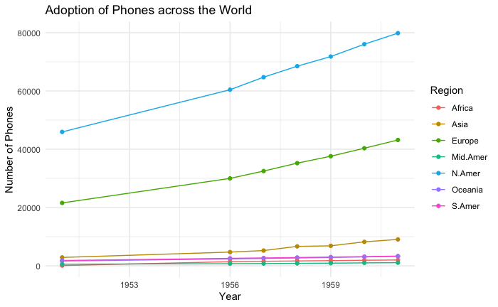
Now. This is a lovely story. Look at how the ‘developed world’ in North America and Europe had a head start, while other parts of the world had a near flat number of phones between 1951 and 1961.
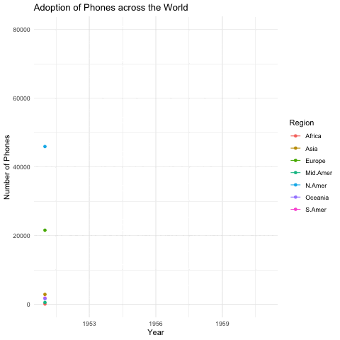
However, maybe it would be nice to add a little bit of drama to this by using gganimate.
Have a look.
# Animate the plot
anim <- p + transition_time(Year) +
  ease_aes('linear')

# Render the animation
animate(anim, nframes = 200, fps = 10, duration = 20)

# Save the animation as a GIF
anim_save("WorldPhones_animation.gif", animation = anim)
This is the result:
We can add a few more aesthetics:
# Create a ggplot
p <- ggplot(WorldPhones_long, aes(x = Year, y = Number_of_Phones, group = Region, color = Region)) +
  geom_line() +
  geom_point() +  # Adding points to see individual data points
  shadow_mark(past = TRUE, future = FALSE) + # Add trail effect
  labs(title = 'Year: {frame_time}', x = 'Year', y = 'Number of Phones', color = 'Region') +
  theme_minimal()

# Animate the plot
anim <- p + transition_time(Year) +
  ease_aes('linear')

# Render the animation
animate(anim, nframes = 200, fps = 10, duration = 20)

# Save the animation as a GIF
anim_save("WorldPhones_animation2 .gif", animation = anim)
And this is the outcome:
Most software packages like powerpoint allow us to use GIF files, and illustrate stories in a more dramatic fashion. Therefore, it may be useful for us to use gganimate when there is story that is to be told.
You can learn more about gganimate here: https://gganimate.com/index.html
And if you’d like to recreate our analysis and take off from where we started: https://github.com/drkbhere/Gritty-Graphs-004-gganimate