
Gritty Graphs - My Tryst with India
My initial encounter with this kind of project occurred while attempting to plot brand stores on a map, a task I undertook as part of a research project that eventually became the basis of my PhD thesis. The solution I devised was quite ingenious. Let me describe the process. Using the dataset provided by the firm, I obtained the postal index number (PIN) for each store. For those unfamiliar, the PIN is a system used by India's postal service to ensure accurate mail delivery. Interestingly, a comprehensive dataset from India Post includes detailed information for each PIN code, including the latitude and longitude of each area. Problem solved, right? Not exactly.
The challenge is that each PIN code often covers a large area. Take Poanta Sahib, for instance, which has only one PIN code for the entire region. This means that if you were to send a letter to any faculty member at IIM Sirmaur, you would use the same PIN code. However, a set of latitude and longitude coordinates pinpoints a specific location on a map, not a broad area.
Latitude and longitude are the coordinates used to identify any location on Earth's surface. Latitude lines run horizontally around the globe and are used to measure the distance north or south of the equator, which is 0° latitude. They range from 90° north to 90° south. On the other hand, longitude lines run vertically, intersecting at the poles. These measure the distance east or west of the Prime Meridian, located at 0° longitude in Greenwich, England. Longitude values range from 180° east to 180° west. Together, these coordinates provide a precise global address. For example, a specific set of latitude and longitude coordinates could pinpoint the exact location of a street corner, a building entrance, or any other specific spot. This precision contrasts sharply with the broad coverage of a single PIN code, which might encompass diverse and widely spread locations within its boundary. Thus, using latitude and longitude data allowed me to accurately map the exact positions of the stores within the expansive areas defined by their PIN codes.
For our readers from around the world, you may use ZIP codes, postal codes, or similar systems in your countries. Much like India's PIN code system, these systems are designed to streamline mail delivery. In the United States, for example, ZIP codes are used. ZIP, standing for Zone Improvement Plan, is a postal code system that helps identify specific geographic areas to facilitate efficient mail sorting and delivery. Unlike the Indian PIN code system, which generally covers larger areas, ZIP codes in the U.S. can be quite specific, sometimes even denoting individual buildings or street segments. Similarly, in the United Kingdom, the postal code system is even more precise, often representing small clusters of addresses or sometimes single addresses.
Returning to the main story, when I instructed R to plot each data point on an XY plane, the result was a dotted map indicating the locations of all the stores. This was the outcome of my approach.
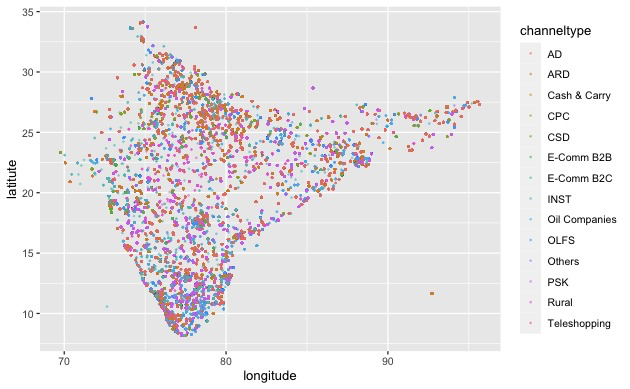
It’s an exciting plot, and it’s likely very correlated with the kind of population there is in each point - but all that information does not immediately popup from the visual. Also, what would we do to use other non-point spaces that are available on a map? Those present obvious challenges.
At this time, I knew nothing about shape files and how they could be used to make amazingly insightful visualisations. Let’s spend the rest of this newsletter exploring how shape files are useful tools for anyone who wants to visualize geographic data.
Introduction to shape files
Shapefiles are storehouses of geospatial vector data format that is commonly used by software to store geographic data. In addition to the location, they also store information about the shape, and attributes of geographic features, such as points, lines, and polygons. You can read more about them this here.
Let me show you a quick demonstration. We’re using the files from here.
Using this shape file and ggplot2 together in this manner:
# Read the shapefile
india_shapefile <- st_read("India-State-and-Country-Shapefile-Updated-Jan-2020-master/India_Country_Boundary.shp")
# Basic plot using ggplot2
ggplot(data = india_shapefile) +
geom_sf() +
theme_minimal() +
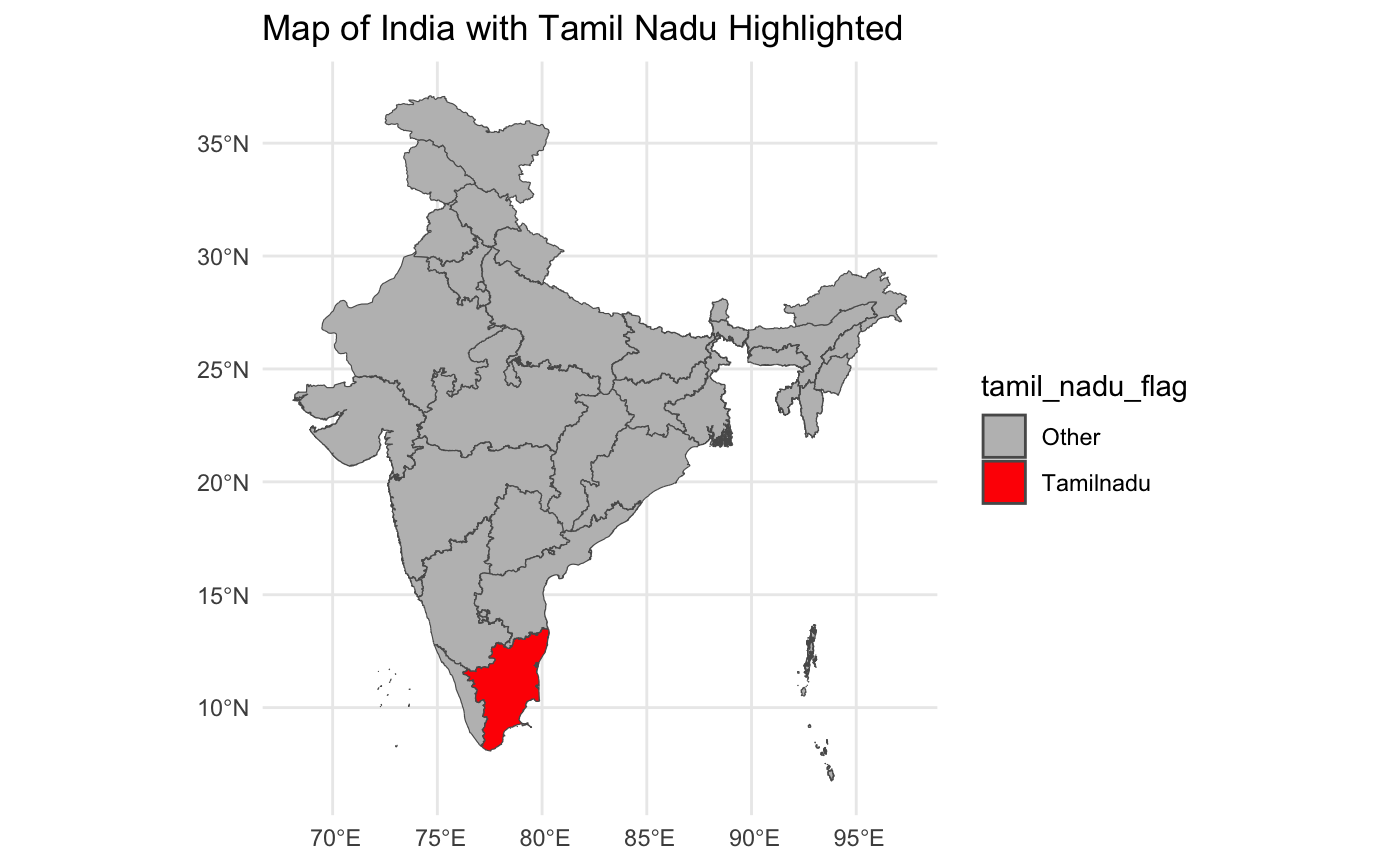
labs(title = "Map of India")We get something like this:

Now, this is impressive!! We can go ahead and add layer after layer of data to this file.
For instance, we only want to see my home state of Tamil Nadu. We can pick up the data, make Tamil Nadu a factor variable, and color it red.
Have a look
More advanced
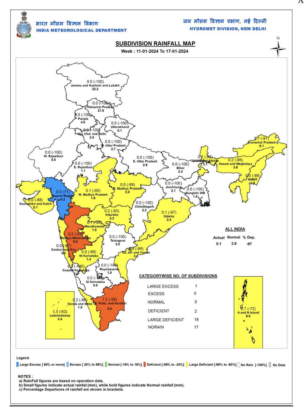
We can go ahead and do a lot more with this data as well. For instance, the India Meteorological Department keeps making charts like this and posts them on their website.
Another good example is a project by Shailendra Paliwal and Kashmir Sihag found here.
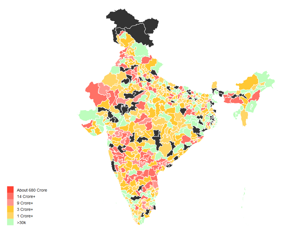
In this file, they use a better, more detailed shape file with constituency-level information and show the Election Commission of India data on how many assets (in Indian Rupee terms) each MP has. This is impressive, and one could do wonders with this visualization. For example, we can easily spot that there is some outlier in Rajasthan. Upon doing a little bit of Google search, I just found out that the Congress MP Nakul Nath is perhaps the richest member of parliament with net assets worth Rs 680 crore. We can also see that in many part of the North East, the net assets is very low. Well, this is all assuming the numbers declared are actually real (which is an altogether different discussion).
We have much to explore. If you would like to pick up from here, here’s a link to all the code that we have written so far:
https://github.com/drkbhere/Gritty-Graphs-003-Shape-Files
Happy learning!
Until next week!