
Gritty Graphs - The Case of Hit-and-Runs
This year started off with a catastrophe. Drivers have been striking across the country. They are protesting against a new bill passed in the Lok Sabha that makes ‘hit and run’ a much more severe crime - increasing the maximum permissible jail time from 2 years (under Section 304A) to 10 years. Considering trucking is a massive job generator for low-educated individuals in the country, this law could, in theory, adversely impact their livelihoods.
On the other hand, there also appears to be a valid argument from the government. The Indian government does not want lives to be lost in the process of ‘hit and run’. According to NCRB reports, there have been nearly 47,000 incidents in 2022 that caused the deaths of nearly 50,815 individuals.
It is during such times that it’s a good idea to look at the data. Sadly, good data is often completely dispersed in different locations, and we often have to go around collecting, cleaning, and presenting them. Luckily for us, rich data sources exist on government websites - in this case, morth.nic.in carries detailed information about accidents and fatalities in its annual reports from 2008 onward. Some of these reports also contain data from 2001 onward.
We look into this data in this week’s edition of Gritty Graphs, pieced together from various sources. Have a closer look at it.
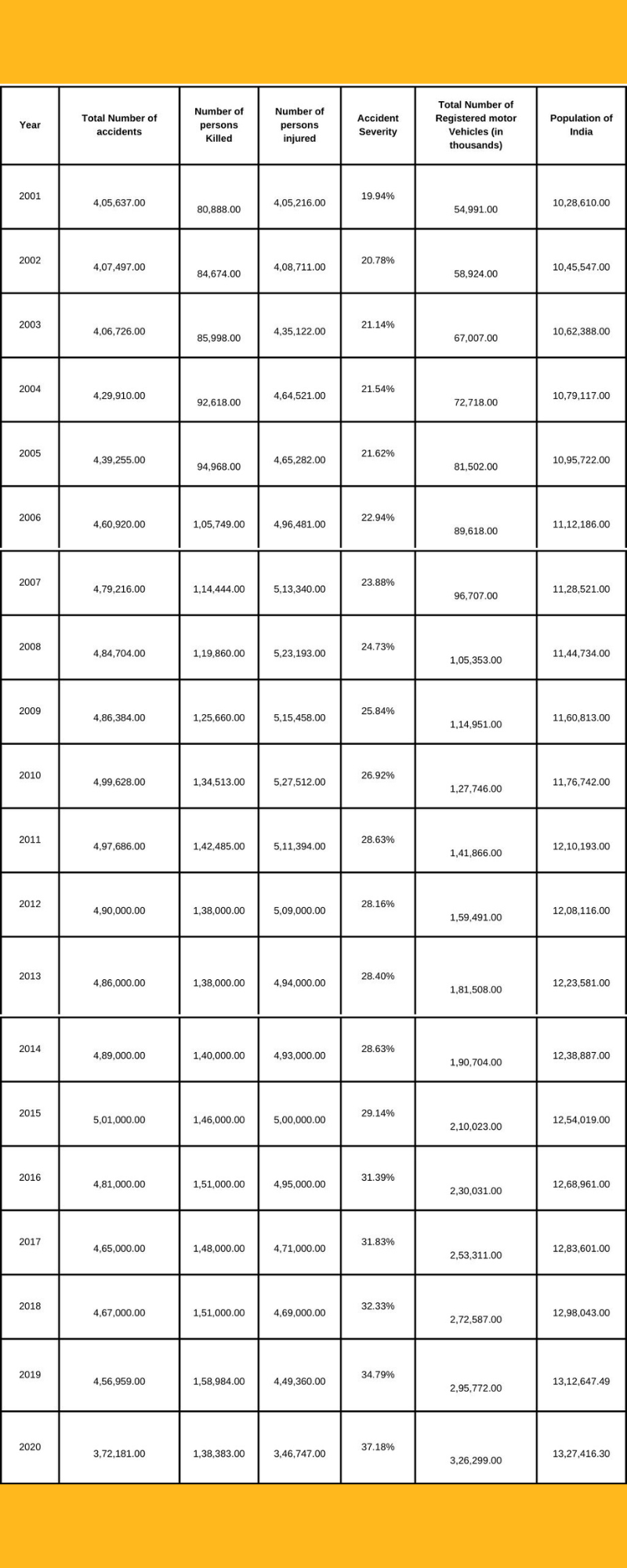
I’m sure that you’ve realized that the 2019 and 2020 entries for India’s population look a little odd. Well, that’s because the data for those two years did not exist. Therefore, I had to extrapolate the numbers based on the past year’s growth rate. A simple calculation like can be used to do the trick.
2019 population = 2018 population * 2018 population / 2017 population. And 2020 population = 2019 population * 2019 population / 2018 population.
The other pieces of information were pieced together from various pdf files, which did not make it easy for me to extract the data in a spreadsheet format. Since this was only a small set of information we were looking at, I could manage with some copy-pasting, OCR and basic data wrangling on R.
When studying the data, it appears that from 2001 to 2020, India experienced significant fluctuations in road safety metrics. In 2001, there were 405,637 total accidents, resulting in 80,888 deaths and 405,216 injuries, with an accident severity of 19.94%. Over the years, these figures showed a general increasing trend. By 2010, the number of accidents had risen to 499,628, with fatalities reaching 134,513 and injuries at 527,512. The accident severity also increased, reaching 26.92%.
The year 2019 marked a peak in fatality rates with 158,984 deaths, despite a lower total number of accidents (456,959) compared to previous years. Interestingly, in 2020, there was a notable decrease in the total number of accidents (372,181) and fatalities (138,383). We could attribute this to Covid.
Now, reading such text can become cumbersome and hard for people to process. This is where a good chart can work wonders. Remember the adage, a picture is worth a thousand words. Now, here’s that picture.

The picture clearly shows that we have a problem of accidents and deaths. But then, it’s important to recognise that during this period, the total number of registered motor vehicles in India consistently increased, from 54,991 in 2001 to 326,299 by 2020. Similarly, India's population grew steadily from approximately 1.03 billion in 2001 to 1.33 billion in 2020. Therefore, the comparison that we just did in the picture is not really an ‘apples to apples’ comparison.
For us to do that, we have to go ahead and put this in context and using a per-vehicle rate. Such charts are really useful for us to understand broad-level changes.

The chart shows that all three key metrics - the number of accidents, injuries, and fatalities - show a marked decrease. This raises an important question: does this trend indicate an overall improvement in driving behavior across society?
Alternatively, one might speculate whether the increase in traffic volume has paradoxically reduced the likelihood of accidents. However, a more nuanced explanation could lie in the reporting practices. It's important to note that while fatalities are generally well-documented, as they require police registration, the same might not hold true for accidents and injuries. Today's societal trends suggest that many individuals prefer resolving such incidents through mutual agreements rather than formal registrations. This practice could lead to underreporting, suggesting that the actual decrease in accidents and injuries might be even more significant than the chart suggests.
Regarding the metric 'Killed per Vehicle', it is critical to understand that this encompasses more than just hit-and-run incidents. It includes fatalities from various causes like rash driving and other types of accidents.
In other words, everything has to be viewed in a certain context. A person who wants to argue that the number of deaths has ballooned in the last few years can use the first chart. Someone who wants to make the opposite argument may use the second graph. Ironically, both of them would be right. But they would be guilty of picking and choosing graphs that suited them.
We may need more data to say something concrete to answer the question we started with. Whatever the case, the fact that 1.4 lakh individuals die every year due to vehicle accidents is really sad. That’s one death every four minutes. Considering that a good chunk of this is happening due to hit-and-run cases, it may be a good idea to implement rules to ensure that innocent civilians do not die young and leave their families helpless. But at the same time, there can be quite a few technological solutions that can also help achieve similar results. But that’s a discussion for another day.
This reinforces something that we talk about in class a lot.
Just because there is data does not mean it’s fact. There are generally a lot of assumptions made with each of the data points that are presented to us (like my extrapolation of the population figures and the negation of the total number of registered vehicles). As consumers of data, it is very critical we question the assumptions and be extremely sceptical about everything that is presented to us.
Sceptical is what we will start becoming as a part of this new series on data visualisation. Here’s the plan: Dr. Advaita and I plan to bring you one article on data visualisation every week to keep you abreast about the stories we can tell with data. I hope you enjoy reading it as much as we enjoy making it.
Until the next edition, have fun!
P.S. I am leaving with you the code for all the plotting that has been performed as a part of this article. If you want to recreate the chart, please give it a go.