NIRF - A Guiding Star or a Snapshot into the past?
This article delves into the National Institutional Ranking Framework (NIRF) and its recent rankings release, examining the framework's shortcomings and the need for a more nuanced understanding of rankings in assessing the academic and placement quality of management institutes.
How certain are you that the NIRF rankings are the holy grail of assessing B School quality? Is the ranking a robust estimator of the academic and placement quality of an institute? Or is it like the GDP - trying to boil down a nation’s economic output into just one number? While there is no denying that rankings like the NIRF have a lot of utility, it needs to be underscored that they are not without limitations. In this article, I try to take a moment to pause and explore the NIRF framework and the rankings that were released earlier last week. Come join the conversation.
What is NIRF?
For the uninitiated, the National Institutional Ranking Framework (NIRF) is a ranking methodology adopted by the Ministry of Education, Government of India, to rank institutions of higher education in India. NIRF ranks institutions in fields such as Engineering, Management, Pharmacy, Architecture, Law, Medical, and Dental science.
NIRF is one of the most widely publicized metrics that is used by many to determine the quality of education that is provided by institutes from across India. While the ranks gain a lot of traction in the popular press, there is much more to the NIRF.
The NIRF goes into great detail to provide scores for five different criteria:
- Teaching, Learning & Resources (TLR): To assess the quality of teaching, learning, and resources available at an institution.
- Research and Professional Practice (RPC): To assess the research output and professional practice of an institution.
- Graduation Outcomes (GO): To assess the placement and employment outcomes of students graduating from an institution.
- Outreach & Inclusivity (OI): To assess the outreach and inclusivity initiatives of an institution.
- Perception: To assess the perception of an institution among employers, alumni, and peers.
A weighted average of these five criteria is then used to create the ‘Overall Score’ for each institute. It is these ranks that students across the country use to make decision about their higher education.
Why talk about this now?
NIRF has become one of the primary sources of information that aspiring students make use of to assess the caliber of an institute alongside. Needless to say, the NIRF is viewed more seriously considering the Government performs the analysis and reports it. The methodology, the data, and other key information are also made publicly available for free. The NIRF, other ranking metrics, and data put out by institutes (such as placement reports, annual reports, blog posts and website articles) are all used in tandem while making decisions on higher education. ‘This’ year's NIRF rankings were released a few days ago and have been making headlines across media outlets used by aspiring post graduate students. (Note: For the purpose of this article, we will try and restrict the scope to just the management discipline). ‘This’ year’s rankings indicate that the Indian Institute of Management Ahmedabad (IIM-A) has retained its top position for the seventh consecutive year while IIM Bangalore (IIM-B) and IIM Kozhikode (IIM-K) have secured the second and third positions respectively. There have been several noteworthy changes in the rankings. Most notably, IIM Calcutta (IIM-C) has dropped to the fourth position while IIM Sirmaur has dropped to the 98th position. Many private institutes have secured good positions too, and have performed admirably when compared with past years.
Considering the timing of the release and the critical role these ranks play in the decision making process of many students, I felt that it was proper that I offer an explanation for why these changes have occurred. I also have a selfish reason to write this piece. I work for IIM Sirmaur and I am fully aware about the scale and scope of the changes that have been made in the last one year since the new Director took over. I thought it would be best to inform the larger audience about the scores and allow them the freedom to make a more informed decision. Understandably, I am going to be limiting the scope of this article to just my institute, IIM Sirmaur.
The Case of IIM Sirmaur
Indian Institute of Management Sirmaur (IIM Sirmaur) is a Centrally Funded Institution of National Importance set up by the Government of India in 2015. It is one of the newer IIMs in the country and is located in the picturesque town of Paonta Sahib, in the Sirmaur District, Himachal Pradesh.

Last year, IIM Sirmaur was at the 69th position in the NIRF ranking while this year, the institute has dropped to the 98th position. While these are facts that are clearly visible on the surface, peeling the layers and taking a closer look at the numbers may prove to be useful. Fair warning again, I am a full time employee of IIM Sirmaur and almost everyone I showed this article to before putting it up online are also associated with the institute at some level. However, I shall try to maintain a balanced perspective throughout this article and shall offer data backup to each of the points that I am making. Going forward I shall argue about how this year’s ranking framework has (1) presented a lagged view of the on the ground reality of IIM Sirmaur (2) compared apples to oranges, and (3) contributes to the kickstarting of a vicious cycle for many organizations that participate in it (I shall also provide examples here). In the process, my aim is to show the limitations that are present in the NIRF in its current avatar.
The lagged realities
Traditionally, the NIRF uses the previous year’s values to compute the current year's rankings. This is understandable. Many institutes are very large and need time to collect accurate data. However, this part of the story does not get reported explicitly. Considering these numbers get passed around as the ‘NIRF 2023 Rankings’, people often come to the conclusion that these figures are a measure of reality at the current point in time. In fact, this is clearly described in the India Rankings 2023 report that is available here.

While the rankings can (and often do) help institutes to make targeted interventions to improve the performance of the institute in the parameters that it measures, it needs to be highlighted that it paints only a partial picture especially considering that it does not take into account most changes that may have occurred during the last academic year (2022-23). Considering most management schools in our country offer only a two year MBA, it may be argued that this approach may actually do more harm than good. To explain further, this lagged ranking process may provide a positive nudge to institutes that are not performing up to the mark while punishing the institutes that are trying to scale their way up. Let me use IIM Sirmaur as an illustrative example here.
Here (Table 1) are the figures from IIM Sirmaur’s ranking in the last two listings (note that IIM Sirmaur has only been on the listing for two years now).
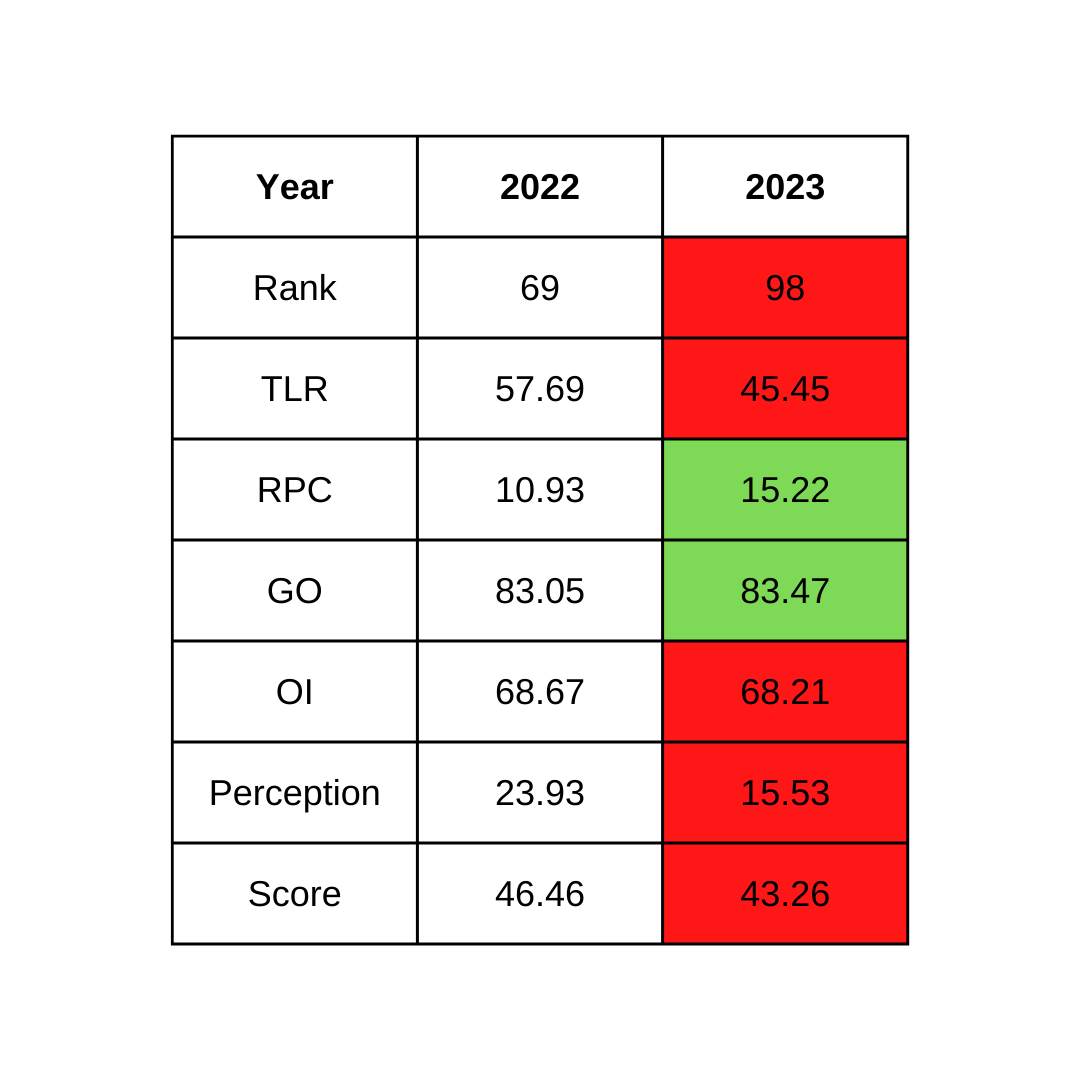
For the purpose of clarity, the total scores are computed based on the following weights of the individual components:
- Teaching, Learning & Resources (TLR): 0.30
- Research and Professional Practice (RP): 0.30
- Graduation Outcomes (GO): 0.20
- Outreach and Inclusivity (OI): 0.10
- Peer Perception (PR): 0.10
If you look closely at the numbers, it becomes very clear that the IIM Sirmaur has actually made significant progress in RP while maintaining similar scores in GO and OI during the Academic year ending 2022. The 3 point fall in the overall score primarily stems from the drop in the TLR and Perception scores. Therefore, these two variables require closer study. Now, let’s try and do just that.
Teaching, Learning & Resources (TLR)- A closer look
TLR basically comprises the following key components
- A. Student Strength including Ph.D. Students: SS
- B. Faculty-Student Ratio with emphasis on permanent faculty: FSR
- C. Combined metric for Faculty with PhD (or equivalent) and Experience: FQE
- D. Financial Resources and Their Utilisation: FRU
If you look closely into each of these numbers from the NIRF website, it once could guess that that drop in score was caused due to a fall in the Faculty-student ratio (which accounts for 30% of the TLR score - source )

This year, IIM Sirmaur should have had approximately a 1:17 ratio considering the school has nearly 35 faculty and around 600 students (~1:17). However, this is something the NIRF does not take into account. Upon taking a look at their fact sheet, it becomes very clear that the NIRF made use of data up to 2022 (despite having data until 2023. Interestingly, IIM Sirmaur, IIT Dharwad, and many other institutions make available the data that they submit on their respective websites.) I know this, because NIRF currently does not consider me any 15 other fellow colleagues who joined IIM Sirmaur in the last one year in their computations.

Considering that IIM Sirmaur student strength expanded suddenly in 2022, while faculty strength goes up gradually. This drop is to be expected. However it is important to note that IIM Sirmaur faculty strength has also doubled in the last one year from about 20 to 40 (since I am one of those who joined in that last one year). Furthermore, the methodology also applies weights (usually 3:1 for last year: and the year before’s data) to most of the parameters, making it harder to climb up the ladder for those that make the right policy decisions or fall down for those who do not).
As one of the newest IIMs that is on its way to establishing its own campus, IIM Sirmaur may be expected to invest resources differently when compared to other more established organizations. This brings us to the next point of discussion.
Comparing Apples and Oranges
Considering IIM Sirmaur is just on the verge of moving to the new campus, while most other institutes on the list already have a fully established campus, it may not be fair to compare the two using the same yardstick. Understandably, different institutes may be at different stages in their evolution. For example IIM Calcutta (of which I am an alumnus) may not need to spend as much on library and laboratory facilities as much as some of the newer institutes. Understandably, IIM Calcutta can pass out a dozen PhD students every year considering they have the pipeline built up already. How would IIM Sirmaur and other new institutes pass out a dozen students and compete on that metric? Simply put, this is fundamentally a case of comparing apples and oranges.
Two years from now when NIRF starts to take into account the investments IIM Sirmaur shall be making on its library and other facilities, these numbers for IIM Sirmaur may far exceed the numbers presented by even most established institutions who have been investing in their libraries for decades. At the time, IIM Sirmaur would have an advantage compared to its peers simply because of the methodology through which the metric is derived. In fact, this is perhaps the reason why the Indian School of Business, Jindal Global Business School and many other reputable organizations do not participate in this ranking framework altogether. However, as an IIM, IIM Sirmaur (and others) may be forced to stay in the framework despite its limitations.
Kick Starting a Vicious Cycle?
In this section, I am going to use charts to make my argument. Let’s have a closer look at the data from 2016 (the inception of the NIRF) till date (you can use the data we’ve collected from the NIRF site).

The chart above presents the comparison of scores and ranks over the years. The charts point to some interesting findings. First, and most apparently, the NIRF framework has expanded from 50 ranks in 2016-18 to 75 in 2019-21, and to 100 in the last two years. Second, during the years, it looks like the slope is steeper in the 51-100 ranks compared to the 1-50 ranks. This could only mean that the competition at the lower ranks amongst the 51-100 rankers is far greater than at the top. While this means that the top ranking institutes stand taller than the rest, it needs to be asked - why is that the case? One plausible explanation is perhaps to do with how the measures are computed.
Let’s look at each of them in greater detail now.
Teaching, Learning & Resources (TLR) charts


As far as the TLR is concerned, it looks like the top folks have a significant lead over the majority that is dotted around the center. The fact that the distribution seems to be getting more normal with time is indicative of a healthy increase in competition over time.
Research and Professional Practice (RPC) charts
A similar story plays out here as well. However, the skew seems to be positive. While the data indicates that a normal distribution is a few years away, it looks like things are going in the right direction overall.


Graduation Outcomes (GO) charts
GO seems to have an interesting underlying story to tell. While it started off as a uniform distribution in the early years, it looks like it has begun to exhibit a negative skew in recent years. This clearly means that the competition at the top is very tough. These are certainly signs of good things to come as management education evolves and institutes focus on Combined metric for Placement and Higher Studies, Metric for University Examinations, and Median Salary , the three key variables that GO captures.


Outreach & Inclusivity (OI) scores
It looks like OI too seems to be maturing nicely over time. From the uniform distribution found during the early years, it seems to have evolved into a nice normal looking distribution. Clearly, this shows maturity and healthy competition.


Perception scores
Perception accounts for 10% of the overall scores. It appears to be very positively skewed. And this is basically the story that I have been trying to tell in the past section. Clearly, it may not be possible for any new institute to displace the perception that older, more established institutes have built in the minds of the target audience over decades of hard work. In my view, it needs to be asked if perception should even be a part of the NIRF scores that intend to measure the quality of education. In fact, we can go as far as to say the NIRF reports contribute to the building of perceptions, either good or bad.


Now that the data has spoken, let’s wrap this up.
Closing remarks
In summary, the NIRF is a good tool, but it should not be taken at face value (much like the GDP). It offers quite a bit of value to users by providing us with key insights into the trends of education - but one should not use it without understanding the layers of meaning that are presented and not presented. My hope here is that this little piece kickstarts a wider conversation on the NIRF rankings and the role that it tends to play in students’ minds and faculty minds when they decide to study or teach. I would love to live in a future where the NIRF goes the extra mile and allows us to consume the data in not such a ‘one size fits all’ format. Perhaps the NIRF could work on building different ranks for different types of institutions (such as established, upcoming etc). NIRF could also allow students to choose the variables that they value the most and generate a metric based on the user inputs. In that case the fact that IIM Sirmaur ranked 35th in graduation outcomes and 46th in terms of inclusivity would not just get brushed under the carpet. Given that I am going to be incharge of one part of that equation in the upcoming year, I eagerly am going to wait for the 2025 NIRF report when they choose to account for it. In my view, the NIRF should not remain a tool that provides a glimpse of the past, but become a tool that looks forward and helps institutes and students become better off.