From Raw Numbers to Narratives: Some thoughts on the fine Art of Data Visualization

A few months ago, I saw a very interesting chart in the Financial times. Let me show you:

Is your spidey sense tingling? Something about this chart seems off, does it not? Well, if you have not figured it out already, this line chart tried to depict two variables that add up to 100. Therefore, there is a line of symmetry at % of spending = 50. I then thought, why was this chart even made in the first place? Is there something fundamentally wrong with making such a chart or am I just nitpicking? Well, the answer is a little bit of both.
Modern software packages like Microsoft Excel can help us make beautiful looking charts with absolute ease. But then, they are simply applying numbers onto charts. This can be somewhat of a hit and miss. There are times when you get absolutely brilliant diagrams to visualize your data, but then, there are also going to be those times when you have no clue what is going on. Let me show you. I have hear with me a dataset about the NIRF I downloaded from LinkedIn. My guess is, there is some sort of relationship between the median salary that students received and the average research per faculty that the institute performed. I can quickly select the two variables (columns) and click on recommended charts and this pops up.
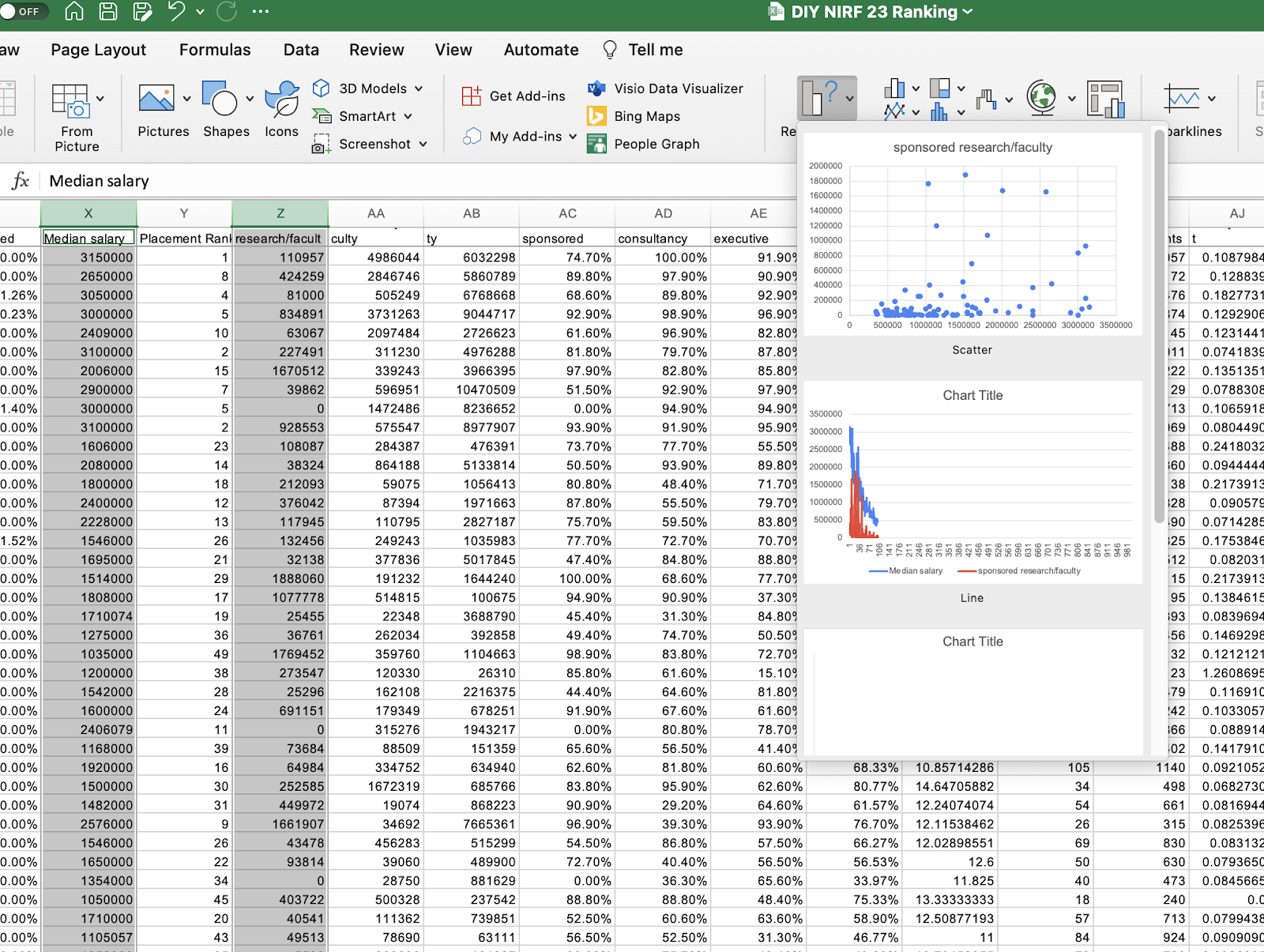
I’m sure you understand where I am headed to now. While one of those charts (the scatter plot) seems correct, the other is outright meaningless. The scatterplot too has issues. It has assumed the salary to be the independent variable and research to be the dependent variable. Logically, we’d want it the other way, but we can’t expect Excel to know this - Excel does not have human intelligence, at least not yet. That’s perhaps why excel allows you to do a whole variety of things with these numbers.

Given the chance, Excel will be able to generate a plethora of good looking, but faulty charts for us. And some of us may end up using them. The same is true for other software programs too.
Therefore, I decided to pen down a quick set of points for us to think about wherever we make data visualizations. So here goes.
The type of data:
The data at our disposal largely dictates the type of visualizations we can generate. The nature, dimensions, and characteristics of the data are key factors to consider when deciding on the most effective visualization method.
To provide some guidance, if you're dealing with single, quantitative variables, histograms and box plots are commonly used. Histograms are especially useful for examining the distribution of data points, providing a clear visual representation of the frequency of different value ranges. They allow us to understand the central tendency, variation, and structure of our data. Box plots, on the other hand, are particularly good for depicting median, quartiles, and potential outliers in our data set. By using box plots, we can easily identify the spread and skewness of our data, which is an essential step in many statistical analyses.
If the data consists of two variables, scatter plots often become the tool of choice. These plots show the relationship or correlation between two numerical variables, where each dot represents an observation. The position of the dot on the horizontal and vertical axis indicates values for an individual data point. Scatter plots are especially useful when you want to visualize patterns, trends, or anomalies that may exist within your data set.
Furthermore, when one of the two variables has a time dimension, such as seconds, dates, months, or years, line charts become a preferred visualization tool. Line charts are excellent at showing changes in values over time, and they can depict trends, patterns, and fluctuations in the data. These charts offer a quick way to identify rises and falls in data over specific time periods, enabling better understanding of trends and helping with predictive analysis.
However, keep in mind that while these are useful rules of thumb, the choice of visualization always needs to be tailored to the specific objectives of the analysis. A well-chosen visualization can significantly enhance the communication of data insights and facilitate decision making based on those insights.
Audience:
Always consider the target audience for your visualizations. This is one mistake that I end up making very often. While some charts are very beautiful and communicate a ton of information, it’s fully possible that the visualization may not serve its intended purpose. There is no denying that some charts pack in a lot of information and are able to communicate volumes - but that does not mean they are good. Let me give you a good example here.
Sankey plots are a type of flow diagram in which the width of the arrows or branches is shown proportionally to the flow quantity they represent. They are named after Irish Captain Matthew Henry Phineas Riall Sankey, who first used this type of diagram in 1898 to visualize the energy efficiency of a steam engine.
Sankey diagrams are typically used to visualize energy, material, or cost transfers between processes. They can also depict the flow of data, traffic, or other quantities in network systems. They are particularly useful when you need to track multiple variables or when you want to display how a single flow (like energy input) is distributed among various subsystems. One unique feature of a Sankey plot is its ability to provide a macroscopic view of the system's flow from start to end, while simultaneously showing detail at the micro level. Therefore, they are very useful in communicating the essence of a large volume of data (have a look at the example I copy pasted from here).

I’ve been meaning to create such a plot for our placement data as a part of the placement brochure. But then, I constantly ask myself, will my intended audience be able to understand it? Or would it end up confusing them? Remember, a data-savvy audience might be comfortable with more complex visuals like heat maps or multidimensional scatter plots, while a general audience might prefer simpler bar or line charts. Therefore, it is critical to always consider the target audience for your visualizations.
Consistency:
Ensure that you use consistent scales, colors, and legends throughout your visualizations. This helps in avoiding confusion and misinterpretation. This is something that I find students taking ‘creative liberties’ with very very often. One reason this could be happening quite often is because you often tend to rely on external sources for your visualizations. Remember, when you copy paste visuals, you are also copy pasting assumptions. Let me give you an example that happened in my class room. One set of students presented market share data of top consulting firms. My guess is, they took this information from the consulting firm’s annual report. This firm typically reports their market share when they assume the market is the top 100 firms in the country. While this is an assumption that’s okay to make and understandable, we cannot use it the way we would use typical market shares. For instance, we may not be able to calculate the size of the total market by extrapolation. Similarly, firms also report market share based on value and volume and this can cause quite a bit of confusion. Therefore, it is absolutely critical for us to understand the data generation process first and then ‘consistently’ present our information to ensure that we understand the data we are visualizing.
Closing remarks:
Transitioning from raw data to meaningful insights is no easy feat. In the realm of data visualization, our goal is to weave a coherent, factual, and simplistic narrative. While software tools aid in this process, they cannot supersede human intuition and understanding. As we delve into creating visualizations, understanding our data and the narrative we wish to portray is paramount. This is why I notoriously pick upon the students who do not create their own charts and graphs. As a teacher, I want you to know what you are saying and writing about.
In echoing the words of Levitt, "If thinking is an intellectual response to a problem, then the absence of a problem leads to an absence of thinking”. The ease of software tools like Excel, generating appealing visuals in seconds, might curb our thought process, thereby inviting potential errors. We must acknowledge and confront the challenge of data visualization, prompting critical thinking. After all, the power of discerning human judgment is instrumental in crafting accurate, insightful visualizations. Let's not undervalue that asset by outsourcing it entirely.
Also remember, just because a chart (or anything) was prepared by someone in a very reputed organization (such as the Financial times or Morgan Stanley), it does not mean that it’s perfect. They are also human beings and they can make mistakes. There are tons of examples from world class places all over the internet, just look around. It is therefore very important that we generate a critical perspective and not take everything that is out there at face value.