Gritty Graphs - Visualizing Complexity
In this week’s Gritty Graphs episode, we will discuss something exciting - Flow Diagrams. These are not diagrams that move but show us how different categories flow from one another in a visual format. Trust me, these flow diagrams are powerful visual tools that do a fantastic job of depicting complex processes that move from one stage or component to another. This helps us understand the connections between categories and analyse where potential issues or catalysts may be hidden.
One particularly fascinating and commonly used type of flow diagram is the Sankey Diagram. The first Sankey diagram was drawn by (you guessed it) one Mr. Sankey (actually, Irish Captain Matthew Henry Phineas Riall Sankey). He used these diagrams to visualise the energy efficiency of a steam engine. Nowadays, they can be used for various processes with relative ease.
Let’s try and understand how a basic Sankey diagram would function. Let’s imagine a simple scenario—a batch (comprising members of two programmes). Very likely, the batch also has boy and girls. But then, How do the two variables talk to each other? In other words, what proportion of the class is boys, and what proportion is girls? These are essential questions to ask.
One way to depict this information is in a table format like this.
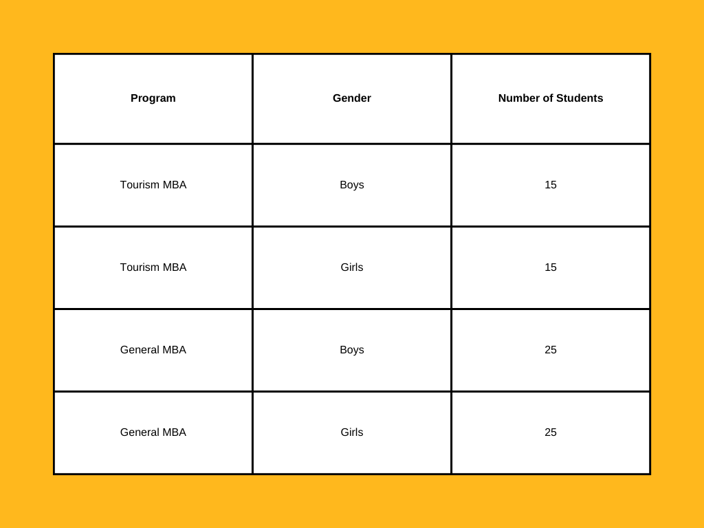
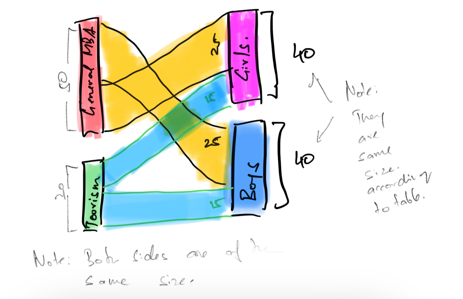
This is somewhat easy to visualise. Let me show you.
Now, what happens if we complicate this even further? Let’s say some of these students want to take up entrepreneurship and others wish to work in the corporate world. What would the table look like? Perhaps something like this:
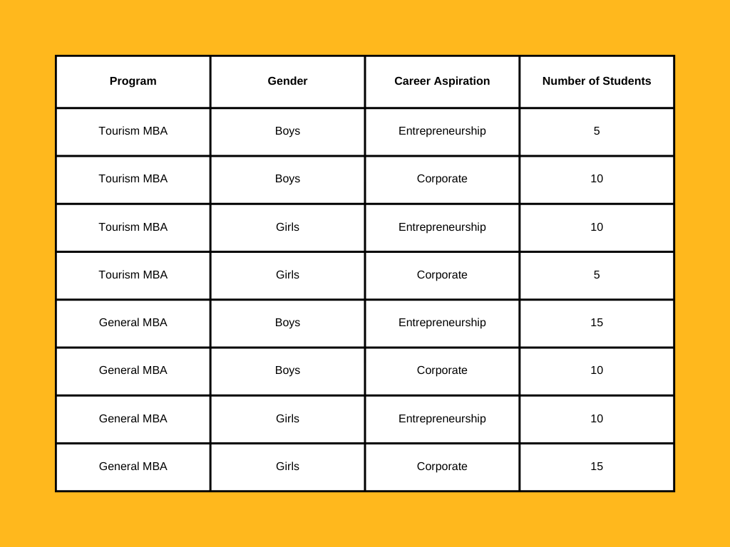
This, on the other hand, becomes more difficult to visualize but can be done by simply adding one more layer to the flow diagram. It’s likely to look like this:
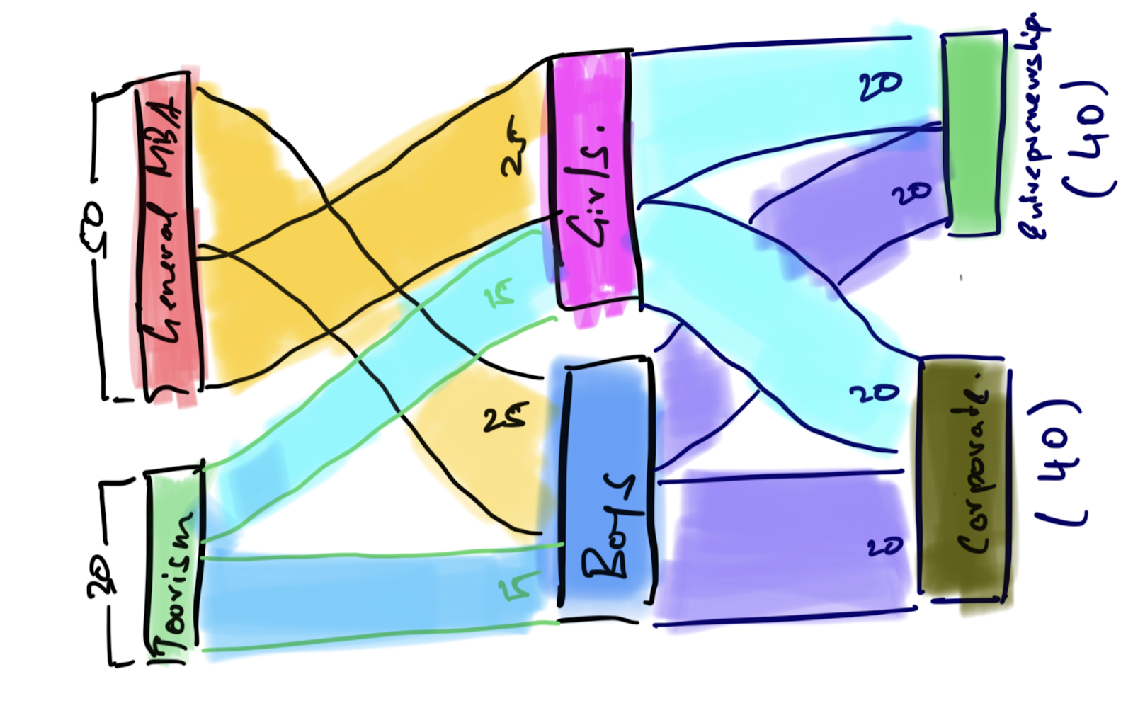
Remember, you can jumble the order in which the flow happens. What I mean by that is, instead of looking at how many boys and girls flow into entrepreneurship, you could see how many tourism and general management students flow into entrepreneurship and the corporate world.
You see how this can get complicated pretty fast?
Thankfully, we don’t have to do the math to work this out on our own. R has two excellent packages, networkD3 and Alluvial, that allow us to create very nice Sankey plots without too much difficulty. Using them, it becomes supremely easy for us to generate complex charts that communicate a lot of information in a beautiful, succinct format.
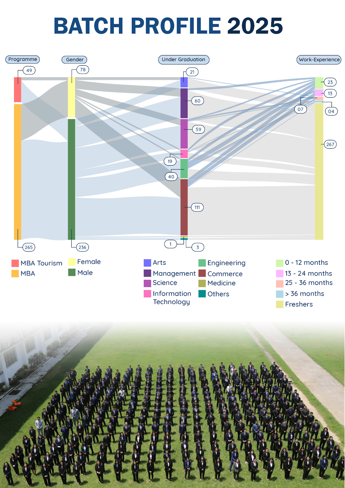
For example, here is a Sankey plot of what the 2025 batch of IIM Sirmaur looks like.
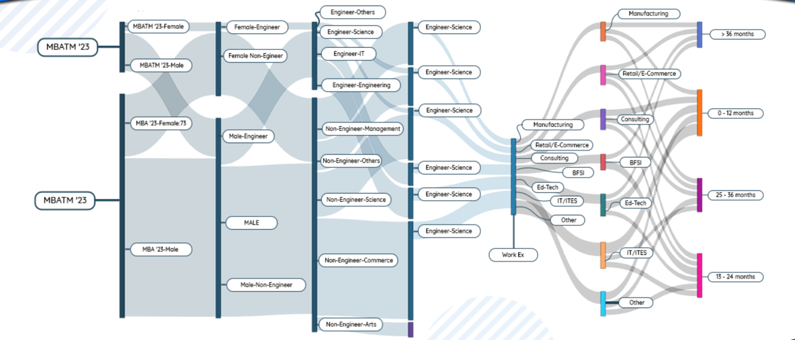
I’m sure you can choose the variables you want to study.
Here’s a more impressive artistic rendition of the same plot (sans a few variables) that our good friends Bhavy Jangra and Dhruv Bordia made from the source files on Photoshop.
What do you think? From the straightforward illustration of gender distribution within academic programs to the intricate mapping of career aspirations, Sankey diagrams bridge the gap between raw data and actionable insights. Perhaps try using them in your project next time when you have an interesting story to tell?